We’ve seen several reversible paintings in past articles that exhibit totally distinct imagery when the original artwork is flipped 180 degrees (for example the great still lifes of Arcimboldo). These works are sometimes referred to as Ambigrams or Reversible Figures.
When a landscape is mirrored in a tranquil body of water, such as a lake or a river, its picture has the quality of being enjoyed both in its normal and inverted posture (i.e., they are “reversible landscapes”), which may account for their unusual beauty.
Paintings and drawings that change their content when viewed upside-down are commonly referred to as “Reversible Images” (or upside-down in English), whereas the term “AMBIGRAMA” (a word that does not appear in the Spanish language dictionary) is usually reserved only for texts, words, or phrases written with “artistic handwriting” that, in addition to their normal reading, can also be read from different orientations, and even though their image reflected in a mirror).

Ambigrams often retain the same meaning in their alternate reading, while they may occasionally convey additional material (often with the opposite meaning of their first reading).
The graphic that rotates with the phrase “ambigrams” is a sentence that retains its meaning even when turned 180 degrees.
We may also see an ambigram of “Aida” that is read as “Beni” when inverted 1800, and a jewel ambigram that reveals the words “amor” or “love” depending on how you look at it.
These are some more ambigrams with various sorts of symmetry.


The first may be read as True and False (in English) without being rotated or reoriented and was developed by Scott Kim, one of the most prominent American ambigrammers we discussed at the conclusion of this essay. Here we have the reversible ambigrams “Madrid,” “Paracuellos,” and “Mexico,” the latter of which may also be broken into parts that, when united, form the flag of this lovely nation.
The word OZONO with capital letters has 90-degree symmetry since the Z may be read as N, and Robert Petrick’s ambigram of the word “IDEAL” is one of the few (I only know of two others) that has specular symmetry (it appears the same reflected in a mirror) and is concurrently invertible (it also looks the same upside down).
There are just seven capital letters that do not change when inverted: H, I, N, O, S, X, Z., while Rene Oswaldo, a notable Mexican ambigrammer, is working on a fully reversible alphabet dubbed “rotator.” Reversible ambigrams might be constructed automatically with these letters, but only of “capicua” words (palindromes) like “ANA”, “OSO”, or “LUZ AZUL”.

However, artistic calligraphy allows us to make even more sophisticated and beautiful ambigrams, such as this one, which is based on cursive round handwriting: The last an is not entirely closed, and when reversed, it can be read as part of the ambigram’s starting m.
Handwriting, in addition to being a communication tool, is also an art form similar to drawing in that it allows us to adorn a message with beautiful calligraphy and, like painting, reveals the personality and mood of the artist who created the text; in this case, the writer.
Although the teaching of artistic calligraphy in schools has been abandoned in the West since the “progressive” reforms of the 1950s (which also rejected rote learning, making many of the new students quite ignorant), the same has not happened in many other cultures such as Islam and Japan, which has the latter as one of its greatest artistic expressions in the “Shodo” (calligraphy written with brush and Chinese ink).

Worse, the invasion of technology in all of our areas has resulted in virtually no one writing by hand and the loss of this sort of visual expression.
Graffiti, a type of abstract art with calligraphic influence, and many corporations’ advertising designs and logos are the only places where creative calligraphy thrives in the Western world.
This article contains Umberto Eco’s thoughts on the lost art of calligraphy. On the 27th of June, 2012, the German daily “Bild” published a fully handwritten front page with the headline: “Alarm! According to its own data, “one in three adults has not written anything by hand in the recent six months, owing to the usage of cellphones, texting, computers, and printers.”.
One of the situations in which creative handwriting is maintained and conveyed with more intensity is in ambigrams, such as this magnificent ambigram of Wikipedia, which resembles being written with Chinese ink and can also be read when inverted (180 degrees symmetry).
TRADEMARKS AND LOGOS
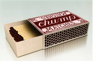
Because of its symmetry and ability to be read from several angles, ambigrams and reversible figures lend themselves well to use as logos. One of the most recent ambigram logos is that of Nespresso coffees, although one of the first ambigrams emerged in 1908 on a “chump” matchbox, which can be read from either side.
The 1977 DELOREAN logo (the time-traveling car in the film “Back to the Future”) was the first ambigram logo placed on a vehicle. It is a beautiful logo that stays similar when reflected in a mirror, such as the rear-view mirror of another vehicle. Many other vehicle companies, like Volkswagen, Audi, Citröen, Mitsubishi, Honda, and Mercedes, utilize insignia with mirror symmetry. The Delorean automobile firm went bankrupt in 1982, and the 6000 automobiles that remain are considered collectors’ goods.

We can see a variety of businesses here that employ various ambigrams as logos. One of the first (from 1969) is Raymond Loewy’s “NEW-MAN,” which is still a clothing brand today. The “SUN” logo has a 90-degree rotation symmetry, while the “ABBA” logo, as well as the “ODECO” trademark, has mirror symmetry. The rest are reversible ambigrams, such as the airline “Swissair” or the brand “Suzuki,” albeit, as previously said, ambigrams that can be read upside down are not popular on automobiles (for obvious reasons), and the majority of them exhibit specular symmetry. Finally, we present the brand of Italian coffee business, “Rondo’s,” etched on the premises’ glasses and cups.
HISTORY OF AMBIGRAMS
In “Angels and Demons,” Dan Brown claims that ambigrams are almost 400 years old, that they have magical properties, and that they were used symbolically by secret organizations formed during the Middle Ages.
All of this, however, is absolutely false: the first known ambigrams originate from the late nineteenth century and the early twentieth century, and were part of the optical illusions that were popular at the time, and were really utterly unknown during the Roman Empire and the Middle Ages.
The earliest recorded ambigram occurs in a compilation of children’s stories published in 1893 by Illinois artist Peter Newell. Newell was an artist of famous novels such as “Alice in Wonderland” and had also written his own stories, but in his two 1893 volumes titled “Topsys and Turvys,” he had the wild idea that the books could be read both face-up and face down, so he designed all the pages with reversible graphics.
The first ambigram we know is on the final page of the first story: the word “Fin” (the end), which when inverted may be read as “Puzzle,” and from this point, we can start reading the book again, but this time inverted.
In 1908, the English monthly journal “The Strand” published many ambigrams in the area of “mathematical oddities,” including one of the matchboxes “chump” which we have already discussed. The first brand logos were produced in the 1960s, but it wasn’t until the 1970s that John Langdon and his friend and associate Robert Petrick devised new ambigrams and were recruited as designers and typographers. Scott Kim also developed new logos and ambigrams in the 1970s, and these three artists are widely regarded as the innovators of this art, despite the fact that it is at least a century older.
Douglas Hofstadter, the physicist and author of the classic 1979 “Mathematics, Art, and Music” book “Gödel, Escher, Bach,” coined the term “ambigram.”
The ambigrams reappeared in Dan Brown’s renowned “Best Seller” “Angels and Demons,” as well as in the film based on the same novel. Tomás Castaeda’s ambigram has both opposing contents in each line of text: “Angels and” is read as “Demons” when twisted 180 degrees. Ambigrams became well-known to the general public as a result of Dan Brown’s book. In the novel “Angels and Demons,” the victims are branded with an ambigram of one of the four elements: Air, Fire, Water, and Earth, strangely spelled in faultless English rather than Latin or Italian.
These are the four-element ambigrams in a composition produced by the great artist John Langdon, whom we mentioned at the end of this essay.

Dan Brown was so taken with this artist’s ambigrams that he made “Robert Langdon” the protagonist of his novel (and also of the subsequent novel, “The Da Vinci Code”) in his honor.
In reality, “Angels and Demons” is a bad novel with a completely delirious plot that was published without success until the author’s next work, “The Da Vinci Code,” was a huge sales success, and only then did the publishers turn their attention back to the previous book, which was relaunched with great media support.

“Angels and Demons” appears to be a “rough draft” of the following novel, complete with a wheelchair-bound villain and a hidden sect that “pulls the strings,” albeit in “Angels and Demons,” the “secret conspiratorial organization” is the “Illuminati,” and in “The Da Vinci Code,” it is the Opusdei.
The biggest (and maybe only) feature of “Angels and Demons” is that it has succeeded in popularizing ambigrams among the general audience.
