Good typography can elevate the most mundane and uninteresting piece of writing into something engaging, interesting, and readable. It’s the difference between reading something and skimming it. A bad design can make a good piece of writing almost unreadable. Typography is the art of using type to communicate, either visually or as text. Typography involves the choice and arrangement of type in order to create a visual or verbal message. Good typography doesn’t just appear; it takes careful planning, practice, and attention to detail. Arranging words on a page is not just about making them look pretty—it’s about communicating ideas effectively through visuals and written words. Great typography is invisible — we read past it instead of noticing it — but we understand its purpose because the meaning comes across clearly instead of getting lost in clunky phrases or awkward syntax.
What is Typography?
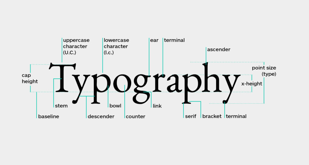
Typography is the art of using type to communicate, either visually or as text. While the term may refer to all aspects of typeface and design, it primarily refers to the style and appearance of the text itself. Typography, as a word, refers to the technique and art of arranging the type in a printed piece. Type refers to the letters, numbers, and symbols used to create printed materials such as newspapers, advertisements, and books.
Types of Typography
Articles on typography are often organized by type of content, as opposed to the type of design. For example, there is a difference between types of advertisements, magazines and books, although all of these fall under the general umbrella of typography.
- Advertising Typography – The main goal of advertising is to sell a product or service. Its purpose is to communicate a message as quickly and as persuasively as possible. For example, an ad for a beauty product might include beautiful, people of all different types to show that the product is appropriate for anyone who wants to look beautiful.
- Book Typography – Book typography is intended to be read, so it uses a different set of rules than other types of typography. The fonts should be readable, but they should also convey a certain feeling, or reflect the content of the book. The layout of the page should be clear and easy to follow so that the reader doesn’t get lost or distracted.
- Magazine Typography – Magazines have different goals than either books or advertisements. They are meant to provide a wide variety of information and appeal to as wide an audience as possible. The fonts used in magazines need to be clear and easy to read, but they also need to reflect the feelings associated with the publication.
Typography tools
Grid and Grid Systems – A grid is a pattern that is used as the basis for a design. It is typically a 9-by-9 grid with 12 columns, but there are no strict guidelines for grid systems, only general principles that can be applied to different types of design.
Colour Wheel – The colour wheel is an easy way to pick harmonious colours that work well together. Different colours evoke different moods, so choosing colours that work together can help create a specific mood in a design.
Colour Schemes – Colour schemes are similar to colour wheels, but they focus on groups of colours that can be mixed and matched to create a variety of different designs. Colour schemes are useful for any type of design but are particularly helpful for designing with one colour.
Colour Theory – Colour theory goes beyond colours themselves to the meanings behind them. A red design might symbolize passion, but a blue design might symbolize calm. Knowing the meanings behind colours can help you create the specific mood you want in your design.
Fonts – Choosing fonts can be intimidating, but there are a few things to keep in mind. First, keep in mind your audience. What fonts are they familiar with? What fonts are they likely to expect to see?
Basics of Typography
Most of these rules apply to any type of design, but they are particularly important when creating typography.
- Alignment – Alignment is how different pieces of text are lined up with other elements on a page. This can include everything from the alignment of a single word to the alignment of entire sections of text. Alignment can be used to emphasize a certain part of a design or quiet other parts down.
- Spacing – Space is just as important as alignment. It is often ignored, but it can have a big impact on the readability of a design. Too much space can make a design seem uninviting. Too little space can make a design seem cramped.
- Rhythm – Rhythm is the beat of the design. It is the way that different elements on the page line up with one another. This can include everything from text alignment to the length of paragraphs.
- Contrast – Contrast is the difference between elements on a page. It is the way that a design uses different fonts, colours, shapes and sizes to create emphasis.
- Readability – Readability refers to the ease with which a reader can understand your design. This applies to more than just the visuals of the design—it also includes things like font sizes, font types and line length.
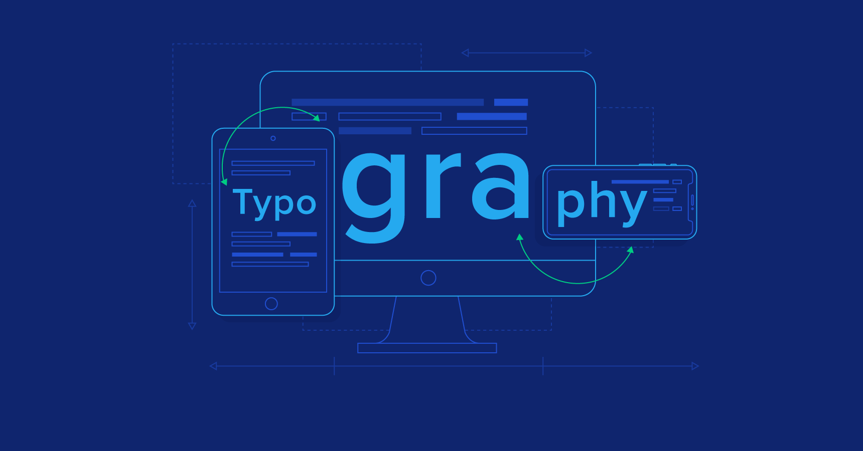
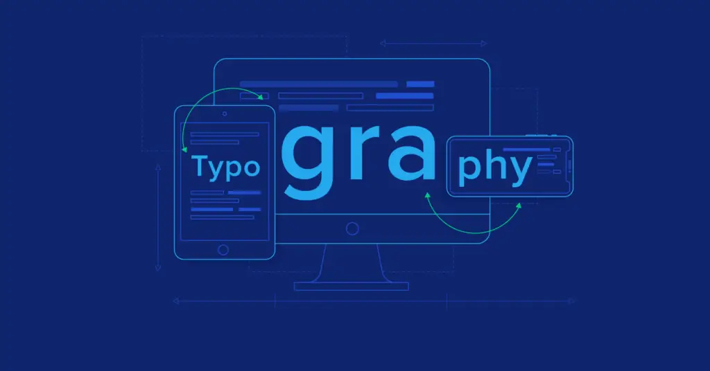
Typography for Websites and Blogs
Typography is important in any design, but it is particularly important in web design. Web pages are primarily designed to be read, so proper typography is essential to good design.
Headline – Headlines are the most important part of any blog or website. They are the first thing that readers see, and they affect how likely people are to click through to the rest of the page. Headlines should be large and catch the eye, but they should also be short and concise, packing as much information as possible into a few words.
Body – The body of a blog post or website is meant to be long-form content, so it needs to be clear and easy to read. Smaller fonts and shorter lines make content easier to read. Appropriately-spaced paragraphs make it easy for readers to find the next section of text.
Conclusion – The conclusion should be short and to the point, summarizing the rest of the post in a few short sentences. This is the last chance to get the reader to click “share” or “like”, so it needs to be effective.
Conclusion
Many people write off typography as a simple design element that doesn’t warrant much attention, but a few simple changes can make a big difference. Good typography can make a design more appealing and easier to read, so it is worth the extra time and effort to make it right. If nothing else, remember that less is more when it comes to typography. You don’t have to use every font in the design palette, or use as many colours as you can fit on a page, to create an effective design.
